
2024 | Enhancing Design Consistency at Ataskate
Overview
Role
UX/UI Designer
Team
Product team: Five UX/UI Designers (including me), and two Product Managers.
Timeline
1.8 years
Tools Used
Figma, Maze, Figjam, Hotjar
When I joined the Ataskate team, they were working with a small UI kit in Figma, but it was not being utilized correctly or efficiently. There were noticeable inconsistencies in design patterns and accessibility standards. With a rebranding on the horizon, it became necessary to update styles, colors, and typography to align with the new brand identity.
The Challenge
None of the designers, myself included, had extensive experience in developing scalable design systems. We were, however, a group of enthusiastic designers eager to refine our skills and enhance the quality of our work.


The Objective
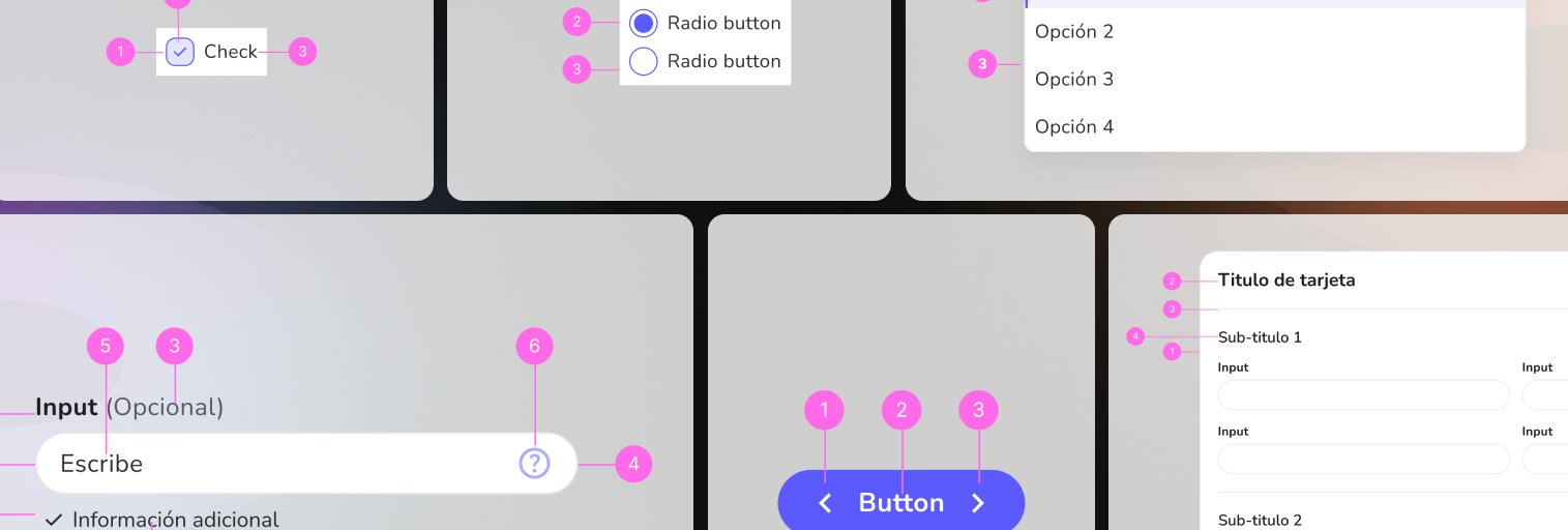
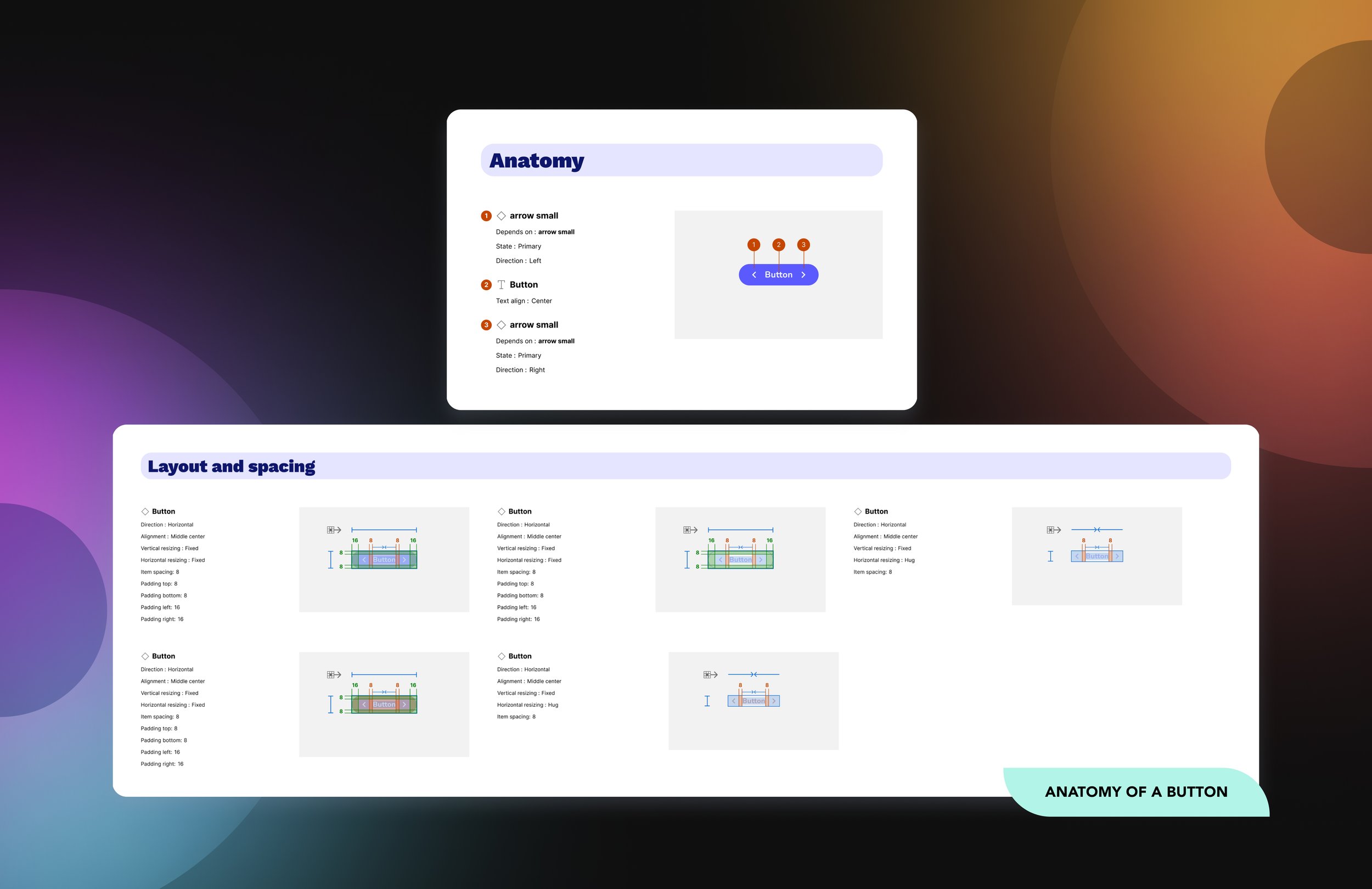
The primary goals were to research best practices for building and maintaining a design system, rebrand the existing UI kit, establish style patterns that catered to both the design team and developers, and create a cohesive design library that adhered to accessibility standards and core design principles.
The solutions & impact
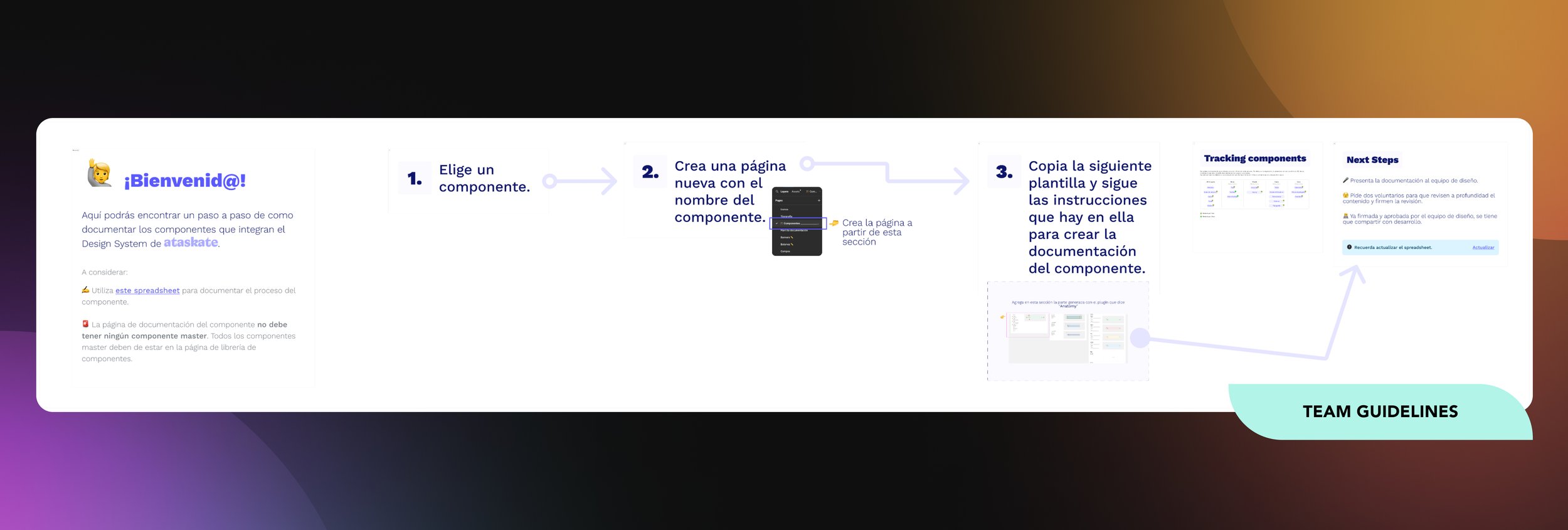
To tackle the inconsistencies, I proactively initiated weekly design meetings to review proposed design patterns, collect feedback, and update components or styles as needed. These collaborative sessions fostered open dialogue, allowing us to identify successful elements and areas requiring further refinement. As a result, we achieved a cohesive visual design across all platforms, ensuring that regardless of who is designing, the layouts consistently reflect a unified aesthetic.
